 |
| Courtesy adidas |
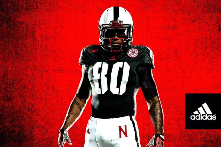
And the most important thing about these uniforms is that the players like them. After all, they are wearing them. It's not about the fans. It's not about the alumni. And these uniforms are fine. I can read the numbers on both the front and the back, and the jersey features a unique font. So I don't have the issues that I had with the 2012 "version 0.1" of the "Unrivaled" uniform. Those were ridiculed as "pajama-like" for good reason... many people found them ugly, but most importantly, the small jersey numbers on the front were illegible. Even the players commented after the game that this style didn't work.
Those were bad alternate uniforms. These are good alternate uniforms. Alternate uniforms aren't inherently good or bad. And it's not an adidas-is-bad, Nike-is-good situation either. Nike dominates most lists of ugly uniforms, and adidas has released some decent uniforms as well.
On the other hand, a lot of the criticism of these uniforms is that they are black, and Nebraska is known as the "Big Red". Well, all white uniforms (hideous as they may be) never stopped a Husker fan from unleashing a GBR cheer. Black won't either.
But it's breaking tradition, they claim.
 |
| Courtesy N'Sider Blog |
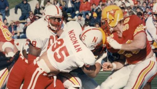
And let's be honest. Black has become an official Nebraska football team color over the years with the the "Blackshirt" tradition. School color? Maybe not. But the color is definitely a part of Nebraska football.
Last year's pajamas were actually based on 100 year old uniform styles when players wore the "N" on the front of the uniform...that was back before someone decided helmets were a good idea. So even those are traditional.
For most fans, I think it comes down to taste. Some people like rap music. Some people like rock. Some people like country. Some people like classical.
Some people like these uniforms. Some don't. Welcome to America, where we all have the freedom to love or hate these uniforms...and tell everybody about it.

No comments:
Post a Comment